
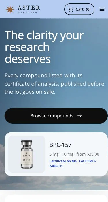
Make the first screen answer the buying questions
A product page should make its identity, variant, price and availability easy to find. On a narrow screen, an oversized hero can push all of that below the fold. Balance the image with a readable title and a clear route to the purchase controls.
Use product imagery that matches the product record. Consistent lighting and cropping can help the catalog feel coherent, but avoid making different products indistinguishable. Include meaningful image descriptions and keep important text in the page itself.
Design selection and quantity as one flow
Variant selection can change price, availability and the applicable quantity rules. Show the selected state clearly and keep the purchase button close to the information that affects it.
When a quantity break applies, explain the unit price and the merchandise total. Test a quantity increase and decrease, not just the initial state. A shopper should not have to do mental arithmetic to learn what a pack costs.
Make the supporting pages part of the experience
A polished homepage is only one stop. Customers also open documentation, shipping, contact and frequently asked questions. These pages need readable headings, useful answers and working links on the same small screen.
Keep contact routes and policies discoverable in navigation or the footer. Use accordions only when their labels make the hidden content predictable. Do not hide the basic purchase details or important limitations behind decorative interactions.
Test the difficult states
Check long product titles, an unavailable variant, missing imagery, an empty search result and checkout errors. Open the menu, research acknowledgment and cart with the keyboard as well as a pointer.
Torva’s public theme demos let you compare these design directions before committing. The final merchant site still needs a pass with its own content, images and connected services. Use an actual phone and review page loading on a slower connection before publishing.
Explore the Desk demo, walk through the eight themes or compare the Torva packages. No account required to explore.