
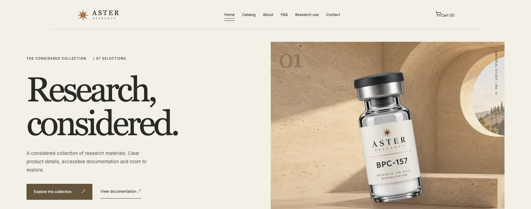
Bring the same content to each design
Use one long product title, one portrait image and one item with several variants. Compare those same examples across themes. Otherwise you may be choosing the better demo photography rather than the better experience for your catalog.
Look at the product page, catalog, documentation, cart and contact page. A striking hero is valuable, but most of the purchase decision happens elsewhere.
Compare behavior at phone size
Check how much scrolling separates the product name from the purchase controls. Open the menu and the cart. Look for clipped labels, tiny document links and images that occupy a full screen without helping the buyer.
For a catalog with many similar names, a clear list or compact grid may work better than oversized tiles. For a small collection, larger images and supporting editorial content may be more useful. The right answer depends on the task.
- Can a visitor tell selected and unavailable variants apart?
- Can they find shipping and support information?
- Does the layout accommodate a real, longer description?
- Can you update it confidently in the editor?
Use the theme as a starting point
Make the typography, imagery and page order fit your brand. Keep contrast and navigation clear while customizing. More decorative elements do not automatically make a store feel more premium.
Torva has eight public theme demos. Core includes two directions, Growth six and Command all eight. Compare the complete experience before choosing a package around a screenshot.
Explore the Desk demo, walk through the eight themes or compare the Torva packages. No account required to explore.